Project Goals
At the time, this was a major pain point in my life. I wanted to create a quick and simple app that would split the distance between two locations and suggest great places to hangout around that area. After asking around a bit and getting a lot of interest, I decided to open it up a bit into a full-fledged web app.
Getting Started
First, I made sure that nothing like this existed. There are similar tools out there, but none of them had the simplicity and speed that I considered essential to the concept.
Next, I started iterating on the interface. After a few iterations on design, I realized that I should probably figure out how to make this all work before getting too far down that road. I was by no means a front-end developer, but by wielding jQuery and Google Maps API, I cobbled together a working prototype and refined the UI from there.
Code-First Design
I ended up building MeetMidway before I designed it. While it was functional, it wasn't pretty. Since I was building the entire thing myself, the only true constraint was time and my technical ability.
From there, I enlisted the help of the internet. I love to use Helio for quick user surveys and it was perfect for this project. I quickly gathered some feedback on how to make this successful—keep the focus on simplicity and speed.
Over time, I molded it into a workable interface that included a bunch of flourishes and details that help improve the ease of use and reliability of the app. I even found some time to make a snazzy logo.
You can check it out live →
The Nitty Gritty
There's a ton of moments that bring this experience together. Here's just a few:
-
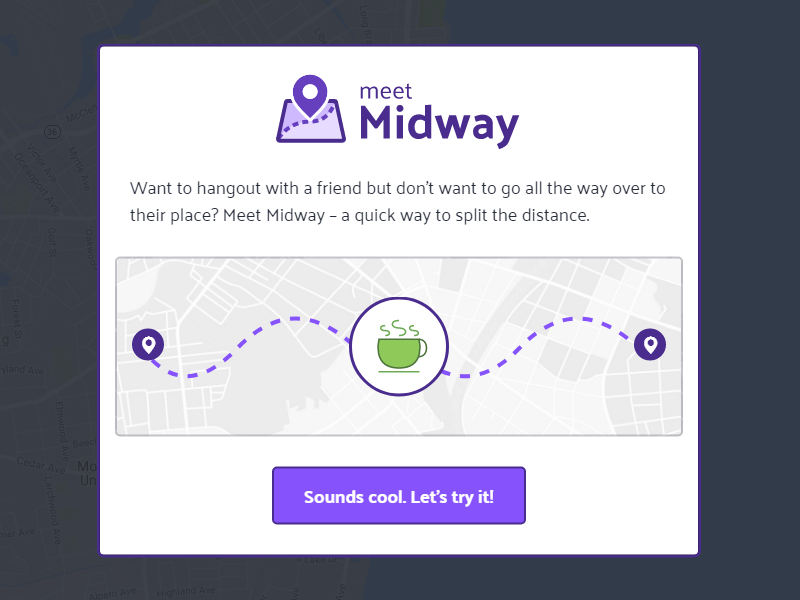
A Simple Greeting
Rather than inundating users with a huge marketing page, a short modal introduction is used to introduce new users to the app and quickly sends them on their way. It only shows up the first time, as to not annoy returning users.
-
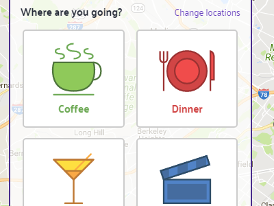
Foolproof Search Input
Based on user surveys, a few of the most common searches are available at the click of a button. This not only removes room for user error, but speeds the input process.
-
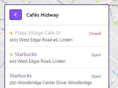
Simple Results
Results are displayed very simply. The venue's name and address is shown, as well as if it's currently open and if it's well rated. From there, users can click to be sent to Google Maps for more details and directions.
-
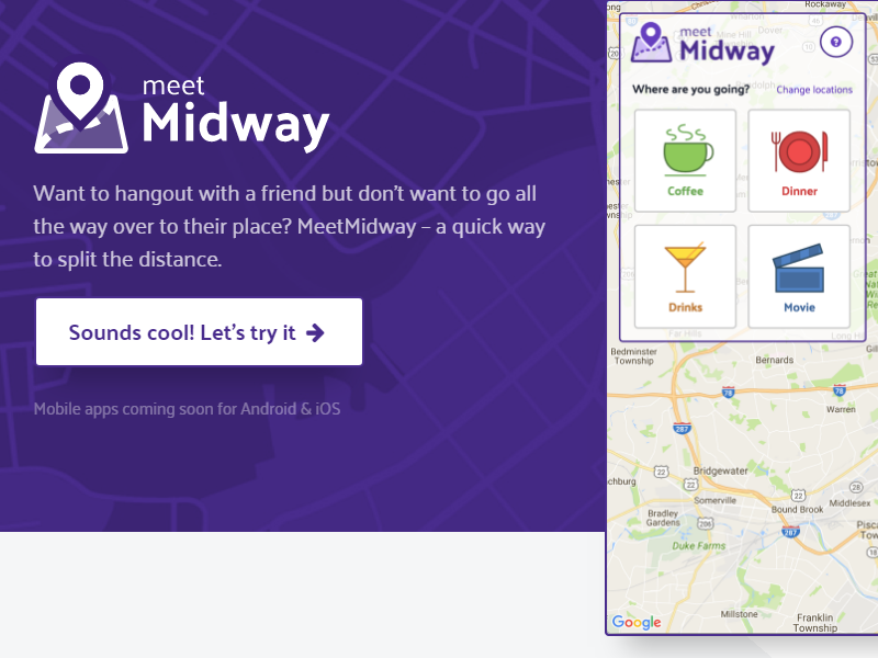
Marketing Page
After the product was put together, I added a quick marketing page for those users who want a little more information. I went a little overboard with the visuals here, but had fun with it. I even included some SVG animation.
With a little coding, it's relatively easy to bake animations into vector artwork. I'm pretty happy with how this turned out. (The animation's a bit smoother on the live site.)
The Results
When released, there was a largely favorable initial response and great feedback. Many suggested the addition of mass transit routes for city dwellers or the ability to add more friends for groups.
Overwhelmingly, users wanted a native app. Although the web app was functional and well-received, no one stuck with it. Porting this to a native mobile app would resolve that issue.
What I Learned
I'd been getting rusty in my front-end development skills, so I pushed myself to learn a ton of new skills to get this up and running. Building the entire product myself gave me a better sense of how design and development can work together to achieve an improved user experience.